Australia
 New Zealand
 Singapore
 Hong Kong
 Malaysia
 Philippines
 Thailand
 Indonesia
Episode 2
Following on from last week's tutorial on how to create the above Power BI dashboard, we come with our second post in the group series. Our trainer Matt has created an interactive dashboard showcasing our upcoming courses and allowing anyone to filter the results based upon courses, locations and dates. We have received lots of questions about how we created the dashboard and this article will describe some key elements of the dashboard and how we created them.
The above dashboard is made up of several elements and below we will continue to explain each one:
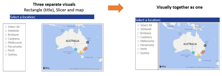
4. More shapes (Formatting multiple visuals as a group)
Each visualisation can be formatted individually with their own title, etc. But with the location slicer and map visualisation we wanted to create a grouped look with one heading. This really brought the interactive dashboard to life.
We did this by adding a shape (a rectangle) and in the formatting pane, we turned on the Title and formatted the Title Background colour to match our logo colour. We then made the rectangle as small as possible – so we could only see the title bar.
The city slicer and map visualisation were then formatted (Titles off, Borders on) and positioned to align with the new ‘group’ title.
5.Displaying images in a Table visualisation (Traffic lights)
On our home page you will notice that our courses have a traffic light status system to show students the availability of our courses (i.e. Courses open for enrolment, limited seats, or at capacity).
We wanted to recreate that same look and feel in Power BI.
Each course has a status and associated to each of the four statuses we have a URL address. For each of the traffic light images (the URLs point to our public website).
We first inserted a Table visualisation and in that we included the fields Date, Location, Course Name, Status and an additional field that shows the text version of the status (to see the effect of this put your mouse over the top of the three dots at the end of each row – after a second the text will appear).
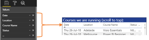
You might notice that in the Table visualisation above the Status column is showing the URL of the image (http://....). What we need to do is categorise that data field so that Power BI knows we want to display an image not just the text (or a link to the image).
Select the relevant data field in the Fields Pane, click on the Modelling Tab and in the Properties Group click on the Data Category dropdown box and select Image URL.
Magic! Power BI now displays the image properly.

Because we were undertaking some data modelling we are only able to complete the above steps in Power BI Desktop.
Tip: After Power BI starts displaying the images in the Table you may need to format the size of your images (otherwise the table rows will be very high). Under the Grid formatting options, scroll to the bottom and adjust the Image Height value to suit.
6.Bookmarks (an option to clear a reports filters)
Power BI is great for filtering data based on a user selecting different parts of multiple visualisations. Click on a city in the map, select a course category from the chiclet slicer. The data will filter accordingly. That’s great, but how do we reset all those filters?
Bookmarks!
Bookmarks have been created to solve this (and are useful for so much more)!
When we create a ‘view’ in Power BI, we can Bookmark that view. Think of a view as a page or chapter in our data presentation story. For instance using filters you create a view of a particularly useful insight to show to your manager (hopefully they give you a raise for spotting an unknown risk or opportunity!)
In our case our view is when all the filters are unselected – like an initial view of the report. Click on the Reset arrow and you are taken back to step one.
Bookmarks can be created, managed and inserted in both Power BI desktop and Power BI service. Simply go to the View tab (for desktop) or the View menu (for service) and turn on the Bookmarks Pane. This will give you the option to create a new bookmark or view an existing one. If you click on the three dots to the right of a bookmark you can also update the bookmark’s view or rename it, there are also options for what the bookmark does.
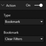
Once you have created a Bookmark you then need to assign it to something. Bookmarks can be assigned as an Action to shapes, buttons or images. After inserting a suitable item in the Format pane under the Action format item you can select the type of action (Bookmark) and then in the second dropdown select the name of the Bookmark you want to assign.
Tip: There is a known issue with Table/Matrix visualisations. After a filter has been applied or cleared the table/matrix doesn’t always return to the top left. Like many things with Power BI there are constant updates and improvements. So we would expect this issue to disappear soon.
Learning more about how to use Power BI will not only boost your employability but also your efficiency and understanding of data. Enrol in one of our popular Power BI courses to begin your learning journey.