Australia
 New Zealand
 Singapore
 Hong Kong
 Malaysia
 Philippines
 Thailand
 Indonesia

Your guide
Last week we created an interactive Power BI dashboard. As a result, we were able to use it to showcase our upcoming courses. Allowing anyone to filter the results based upon courses, locations and dates. We have received lots of questions about how we created the dashboard and this article will describe some key elements of the dashboard and how we created them.
The above dashboard is made up of several elements and below we will explain each one:
1.Images
The Excel Consulting logo and our helpful trainer holding a laptop
At this stage, images can only be placed into a report using Power BI desktop. Once published to the Power BI Service, you can edit the layout and size of the image or pin it to a Dashboard.
Tip: Images can be added to a Dashboard in the service – but this needs to point to a URL image.
To insert an image in Power BI Desktop, click on the Home tab, and in the Insert Group click on Image. This will open the file explorer, there you can browse to a location on your local computer. Or a synced SharePoint or OneDrive folder.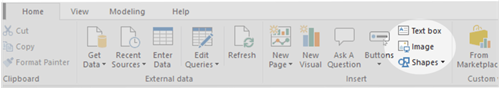
2. Shape and Text box
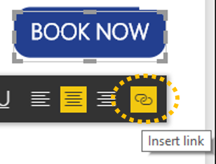
The text “Book Now” is a hyperlink to the Excel Consulting booking website
To create the look of a button, a shape was first inserted (click on the Home tab, and in the Insert Group, click on Shapes and select a shape, a Rectangle in this case).
To give the look of a button the edges were rounded. In order to do this firstly, select the shape and in the Format pane under Line. Increase the Round edges value. A custom colour was also used to match the button to our Excel Consulting logo, under Fill click the dropdown box for Fill color and then click Custom Color. You can then select a colour or enter a HEX colour code.
Tip: Use MS Paint to get the RGB colour code, for instance rgb(35, 63, 143), then google the whole code to get the HEX colour code.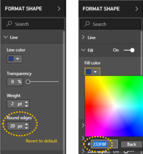
A text box was then inserted on top of the shape. If required, select the text box and click on the Visual Tools: Format tab. In the Arrange Group click on Bring forward or Bring to front.
To insert a hyperlink (this can be to any URL – a website or another Power BI report). Select the text you would like to convert to a link. After that, click on Insert link. This located on the text formatting toolbar.
3. Custom Visualisation
Chiclet slicer using images
Power BI comes with all the standard charts and visuals. But if you want to add something different you can import a custom visualisation (you can even create your own!).
For this report we imported a Chiclet Slicer. It displays an image and acts as a slicer, filtering our data on the page. Images for the Chiclet Slicer have to be in a URL format and therefore accessible to your audience. For our images we used ones straight from our public website!
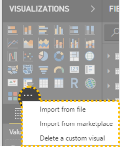
To use a custom visual, in the Visualisation pane click on the three dots (also known as the Ellipsis). Then you can either import from file (a custom visual you have already downloaded or created), import from marketplace (a new window will take you to the Microsoft store) or you can delete a custom visual you have previously loaded.
There are many custom visuals to choose from, many are free with some premium subscription-based offerings also entering the marketplace. Be aware that custom visualisations can have data security implications. If the data is processed by a third-party before the visual is rendered. Check with your IT support team if you are unsure.
Learning more about how to use Power BI will not only boost your employability but also your efficiency and understanding of data. Enrol in one of our popular Power BI courses to begin your learning journey.