Australia
 New Zealand
 Singapore
 Hong Kong
 Malaysia
 Philippines
 Thailand
 Indonesia
One of the best ways to communicate your data effectively is to create a story with your data. You can tailor the visualisations for a specified topic to make it more relevant and therefore increase engagement. You can create a number of effective visualisations for your data by using infographics in Microsoft Power BI. Make it fun, get your readers attention!
Try using the Custom visualisations in the marketplace. In this article we will be utilising the Infographic Designer visualisation developed by Microsoft.
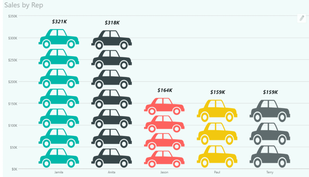
The sample data is fictional car sales data. Any resemblance of the sales reps to actual people is purely coincidental. In this example, I will use the standard graphics that come with the visualisation, but you can upload your own graphics to use, for example, brand logos.
To get started make sure you have the following set up:
- Power BI Desktop with data already imported
- Internet access
- Report view in Power BI
The Process
To begin, firstly in Power BI Desktop go to the Visualisations pane and look for the Ellipsis (the three dots) after the last visualisations tool. From the menu, choose import from Marketplace. Choose the infographics category and look for “Infographic designer” and choose Add to import the graphic.
When you have loaded the visualisation, it will appear as an Acorn….
To start, select the Infographic designer tool. In this example we will drag “Make” from fields into Category in the Fields properties. This will typically be a text field. Then we drag “Sale Price” into Measure, this should be a numerical or currency field.

The Initial graph is a plain column type. This can be changed to bar or line via the Format section of the Visualisations pane. To give yourself more room to work in, go into focus mode.

To access the settings unique to Infographic Designer, click on the pencil found to the top right of the visualisation. Click on the Shape tool to change the graphic or upload your own graphic. You can choose multiple units with most images. This setting will give you multiple stacked graphics rather than one large stretched graphic.
If you want to use a different image for each category e.g. different brand logos, click the link to the right of the shape tool. This gives you access to assigning a different image based on relevant field e.g. Make. You can do a similar thing with The Value Colour setting to assign different colours to different categories, e.g. if you need to match a corporate style guide in your visualisations.
Text labels can be added to display key information e.g. totals and can be formatted to display clear of the data.
If you want to use your infographic visualisations outside of Power BI, e.g. an infographic you are assembling in another tool, then you can either use a screen shot tool or save to PowerPoint. To learn more about creating infographics in Power BI book a seat on one of our courses.