Australia
 New Zealand
 Singapore
 Hong Kong
 Malaysia
 Philippines
 Thailand
Introduction
R is a modern programming language, suitable for complex mathematical calculations, statistical analysis, creating graphs, and reporting.
It was developed by Ross Ihaka and Robert Gentleman at the University of Auckland, New Zealand. Both of its creators start with the letter "R", hence the name given to the programming language.
This article is for programmers, analysts, and statisticians looking to get familiar with R and learn how to use it. We will discuss how easy it can be to code programs in R language.
Before we do that, let's discuss some salient features of the R language:
- R is a simple yet effective programming language that includes conditional branching, loops, recursion, and I/O facilities.
- R supports multiple data types like arrays, vectors, lists, and matrices; for storing data in a way that is assistive in its usage.
- R has a rich set of operators, pre-defined functions, and numerous libraries for advanced calculations and analytics.
- R also supports libraries and graphical charting for data analysis and reporting.
As such, it comes as no surprise that R is the world's most widely used statistical programming language. In this article, we will demonstrate R's capabilities by providing a few different program snippets.
We will cover the steps to create a bar chart, to illustrate that R not only does calculations but also has the capability to create intuitive visuals.
Creating Bar Charts in R
For creating bar charts, R has a function called barplot().
The syntax for the barplot() function is:-
barplot(H, xlab, ylab, main, names.arg, col, args.legend)
Definitions of these parameters are as follows:
- H: This parameter is a vector or a matrix containing numeric values which are used in a bar chart.
The matrix data structure in R holds a collection of elements of the same data type (numeric, character, or logical) to be arranged into a fixed number of rows and columns, i.e., double dimensional array.
If you use a matrix here, R will plot a stacked bar chart.
- xlab: the x-axis label, this parameter is the label for the x-axis in the bar chart.
- ylab: the y-axis label, this parameter is the label for y-axis in the bar chart.
- main: This parameter is the title of the bar chart.
- names.arg: This parameter is a vector of names or strings, appearing under each bar in the bar chart.
- col: This parameter is used to give colors to the bars in the graph.
- args.legend: optional, determines where the legend will be placed and displayed.
A simple Bar chart
If I call the functions with the following parameters,
barplot( c(12,28,3,41), xlab="MyXLabel", ylab="MyYLabel", main="My First Bar Chart", col="blue" ), the chart returned is shown below
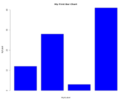
As you can see the chart is titled properly, the x and y axis have been labeled with values passed in xlab and ylab, the color is blue as specified in parameter col.
More often we need to compare values as groups, like sales of different products in different regions OR marks obtained by students as a total of all subjects.
For example, let's assume there are 3 students in a class, and they study 5 subjects. We want to compare the overall performance of these students but also want to see how their individual scores across the 5 subjects compare.
Our data matrix can have values like 82, 76,89,49,54 for student1 ; 67, 98, 99, 56, 71 for student2; 93, 80, 50, 65,52 for student3.
Since we want to plot 3 bars each representing a student, and we want their individual scores in all 5 subjects to be stacked up, we specify nrow=5 and ncol=3.
Our matrix of values to be passed to the barplot function will look something like
Values <- matrix( c(82,76,89,49,54, 67,98,99,56,71, 93,80,50,65,52) , nrow=5, ncol=3, byrow=true)
Here is an example of code input:
# Create the input vectors.
colors = c("green", "orange", "brown", "red", "yellow" )
stnames <- c("Mary", "John", "Gill")
subjects <- c("Eng", "Math", "Science", "Social St", "Computer")
# Create the matrix of the values.
Values <- matrix( c(72,76,59,49,54, 67,78,59,56,61, 73,80,50,65,52 ) , nrow=5, ncol=3, byrow=TRUE)
# Create the bar chart
barplot(Values, main = "Performance comparison", names.arg = stnames, xlab = "Students", ylab = "Total Marks", col = colors )
#Ad an optional legend
legend("bottomright", subjects, cex = 0.7, fill = colors)
The chart from this data should display like the graph shown below:
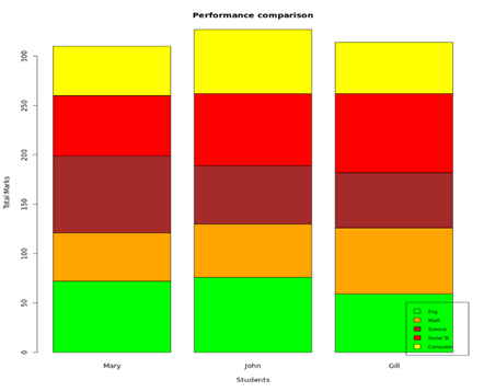
You can also pass the "args.legend" parameter to the barplot function itself to place the legend as per distance from x/y coordinates. As you can see, R gives us a stacked bar chart depicting the contribution of each subject in a student's total marks obtained. All the stacked bars are uniformly colored based on subject names.
Here is another variation of the above-stacked bar chart.
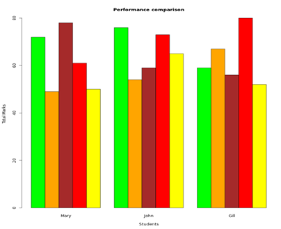
Here a "beside=TRUE" parameter has been added, so now the bars are not stacked on each other, but they are instead depicted side by side. Each student has their own group of bars.
This type of depiction clearly shows:
- Which subject(s) contributed heavily to a student's total
- The top and bottom performers in each subject
- If there is a lot of variation in the marks or if some student has scored consistently higher in all subjects
Conclusion
To conclude, we have demonstrated how to make a bar chart in R.
R is powerful enough to handle all your mathematical and statistical calculations required in the big data analytics space. It is likely worthwhile to take an R course to add this program to your skillset.