Australia
 New Zealand
 Singapore
 Hong Kong
 Malaysia
 Philippines
 Thailand
 Indonesia
Dashboards and Data
Excel crunches numbers very effectively, but it must always be remembered that it is also a communication tool just like Dashboards. The messages in your data must be read and understood, without a struggle.
Dashboards must rely on good data or they won’t be effective or maintainable. The design aspect of the dashboard is also vital and relies on a totally different set of skills to get right. These are the skills of visual business intelligence. Here are some design ideas to think about.
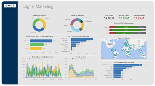
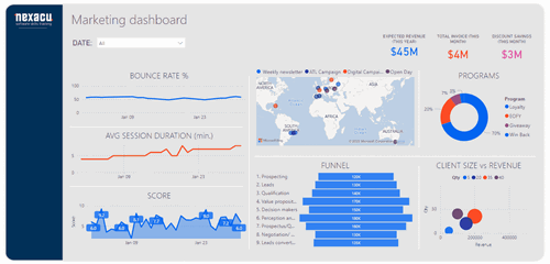
Dashboard Design
The primary rule that should be followed is clear – simplify as much as possible. What is the key message that you are trying to communicate on the dashboard? Once you know that, put that data in the best position to be read. Studies consistently show that people’s eyes are drawn first to the top left of a screen, so that locality is “king”.
Your dashboard also shouldn’t be “everything to everyone”. Inconsequential data gets in the way of the primary information needed. Avoid the temptation to fill white space because your dashboard looks lopsided. The correct use of Proximity is an important principle in graphic design. Background fills should be used sparingly if at all. Use the white space between visualizations to split up the parts of your dashboards and if necessary, move some closer together and some further apart to show their relationships.
Data is important and doesn’t need jazzing up to make it look more impressive. Keep the use of green, yellow and red in either font colours or fills to the traditional meanings of those colours.
You should also de-emphasize labels and titles by using lighter colours and hues, so your data stands out from them. They should still be able to be read, but they are not the main information.
To sum up – key data has primary importance. Make it clear. Declutter the view. Don’t distract and your message will get across efficiently.
Learn how to make amazing dashboards at one of our highly reviewed Power BI courses.